With the design phase now completed, your manuscript and the design brief will be sent to a typesetter, who will take your text and illustrative material, setting it out on the page ready for printing.
An art and process
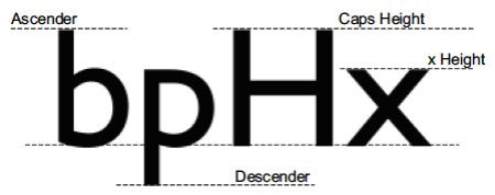
There is a lot more to typesetting (and its sister, typography) than you would think. Both have their origins in the Gutenberg revolution and each, in their different ways, were concerned with the presentation of textual material in type format ready for printing. In earlier times there was a big difference between them. Typography was the art of designing, setting and arranging type whereas typesetting was the process (or craft) of actually setting the type.
Note the class difference: typography wore a beret and twirled a designer’s pen, typesetting wore an apron, punched type and had ink on its fingers. As we shall see, however, the differences between the two have blurred in recent years.
Together, typography and typesetting combine an art and process that only really succeeds when invisible. In many respects, the layout of your book is comparable to the background music added to a film. Its primary duty is to make your text clear and accessible, but ideally it should also enhance the meaning with mood and style. Though stylish, the layout must also be durable (indeed timeless), transcending fashion. Much creative energy goes into this art, which is the subject of passionate debate among its practitioners.
At the forefront of the publishing revolution
The differences between typesetting and typography have narrowed (even blurred) due to the digital revolution and advent of desktop publishing (DTP), which has virtually obliterated other forms of typesetting in recent years.
At the sharp end of publishing – in the production of books, journals, etc. – the old, quite laborious and expensive process of producing print-ready material by hand-setting individual lines and pages of type (a job for well-paid tradesmen) has given way to on-screen, WYSIWYG page composition using personal computers and (usually) lower-paid semi-clerical staff.
In parallel with (and a precondition for) this transformation was the development of things we all take for granted today (everyone, not just publishing professionals) – the personal computer, DTP software, new digital fonts (see below), laser printers using the Postscript programming language, and PDF (which renders Postscript into a viewable, WYSIWYG format). An even more recent addition has been the arrival of text mark-up languages like XML; originating from the old pre-DTP typesetting systems, these are still esoteric, even for many publishing people.
For a while, typesetting came in-house for most publishers and many of the old, specialist typesetting firms went bust. In recent years, however, further cost-cutting by publishers has seen this typesetting work move out to local freelancers and further afield to places like India. (I have described this development elsewhere in greater detail, if you are interested.)
At the same time that the process of page layout has been transformed, a parallel transformation has been seen in typography. Here, there have been huge advances in typographical design, not least the development first of scalable, digital fonts followed by an explosion of new designs and more recently the digital capture and standardization of all the world’s varied alphabets and scripts in the form of Open Type fonts.
These advances have been an essential feature of the digital revolution in publishing. Without them, there would be no #e-publishing, no e-readers like the Kindle, probably no iPhone or other smart phone, and indeed even the PC, Web, etc. would be far more limited things than they are.
Key concerns and tools
According to Wikipedia, ‘Traditional typography follows four principles: repetition, contrast, proximity, and alignment.’ The same could be said for typesetting; they are classic requirements of a good design and layout. In essence, then, when laying out your book, your typesetter will be concerned to:
- Fit your text and illustrations into the agreed page extent.
- Place text and illustrations in an effective and appropriate combination.
- Apply a layout that is uniform and predictable.
- Implement a design that is elegant but also clear and readable.
- Deliver the print-ready PDF files on or before the agreed date.

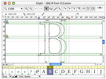
Given the sophistication of today’s DTP software (programs like Adobe InDesign, for instance), the typesetter of your book will have a vast array of tools at his/her disposal to ensure these goals are met. There are too many to list here but among them will be:
- a selection of appropriate fonts in different sizes and styles;
- paragraph and character styles, assigning uniform values to text (font, size, colour, alignment, etc.) that can be globally changed in an instant;
- hyphenation, character spacing (kerning) and line spacing (leading), allowing fine adjustments to how much space an amount of text actually fills; and
- much more (e.g. alignment and rotation, linking to external files, layering, use of colour, etc.)
Such is the world of the typesetter. But, as shall be seen in my next post, this esoteric world about to impinge on your own.
(Post #8 of the Design & Typesetting section of a lengthy series on the book production process, the first post of which is here.)


I am curious about two things in your experience.
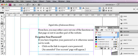
First, when you typeset a book, do you use serif or sans-serif fonts? I ask because your first graphic example above is sans while the others are serifed. I think the #1 error inexperienced designers and self-publishers make is to use a sans font as the book text. What are your thoughts about this? Am I wrong? Can one effectively use a sans font for book texts?
Second, what are your thoughts about hyphenation? Should hyphenation be used? This becomes a more significant issue when non-English words are used in a DTP program with English hyphenation rules. If you use hyphenation in your texts with Asian romanized words? If you do, usually to prevent rivers or unsightly gaps, do you have your authors check the hyphenation or do you spot check to make sure the non-English words are not hyphenated?
I look forward to your reply.
Hi John. This is an interesting issue. I’ll write a fuller post on this one of these days. Meantime, here’s a brief response. We always use serif fonts for the body text (as this is far more readable) but may use sans-serif for headings. Normally, we manually hyphenate when typesetting though my experience when using InDesign is that its automatic paragraph-centred hyphenation works pretty well. That said, with any automatic feature, you can get weird results (including in this case inappropriate hyphenation of a romanized Asian word). The solution to this is either manual hyphenation and/or (as we do anyway) to proof the typeset text, all of it. Cheers. — Gerald
John: Did I reply to you on this? Serif fonts for body, of course, but sans can work for headings. Personally, I use InDesign’s auto-hyphenation feature but other typesetters I know throw their hands up in horror. If you do, then you need to check that nothing dumb is hyphenated and that, if non-English words are hyphenated, this is done at the correct place. Cheers. — Gerald
[…] has also had a major effect on the whole production process in publishing. In an earlier post, I described the changes in typesetting technologies and practices in recent years. Fundamental […]
thanks for the description of typesetting and its relationship to typography, however my concern is on its difference from typewriting and word processing.
Typesetting is the process of taking the (word processed) text and laying it out on the page, possibly together with non-text elements like maps and photographs. Fuller description at:
I would like to know more about typesetting,especially on how to do it and able to practice it.
Second is to thank the producer for producing the manuscrip that is helpfull.
I agree with your comments regarding the use of sans serif fonts in most books. However, there are cases for using them in body text, too. Those acquiring literacy skills for the first time are taught letter shapes based on their hand printed form. Therefore, early reading books often use a sans serif font, as it more closely resembles a handwritten text, which is more familiar and subsequently easier to read.
Many African languages use the Roman alphabet with ‘additional’ graphemes such as the schwa. For these languages, serif fonts can make reading more difficult. This is possibly best illustrated by comparing a serif ‘a’ with a schwa (aǝ).
Yours delighted that someone else finds this interesting,
SMG
Literacy Consultant
[…] Most Indian publishers, even the ones who have MNC counterparts, outsource their typesetting work (What is typesetting) to a third-party where plates are made digitally and then a physical final converts into a […]
[…] print-ready .pdf of the manuscript. Typesetting, friends, involves a lot more than you think. Read THIS to see what. And no, Word is not a typesetting platform. You’ll need InDesign or something […]
Appreciate the recommendation. Will try it out.
[…] Most Indian publishers, even the ones who have MNC counterparts, outsource their typesetting work (What is typesetting) to a third-party where plates are made digitally and then a physical final converts into a […]
[…] If you want to learn more about typography and typesetting, I’d suggest checking out this excellent site on typesetting. […]
Is there a way to have sentences in a paragraph of equal length without having so much space between words that it looks like crap?
You need the right software. For instance, with Adobe InDesign, the main program that typesetting professionals use, you can very finely control letter spacing and do many other things besides. This you cannot do in Word, which is useless for laying out text. The problem is that InDesign doesn’t come cheap (though the monthly subscription isn’t too bad).
I stumbled upon your article reading for my PR exams, I’m so glad I did. Interesting article even clear for beginners like me. After reading this piece, I’m more inclined to perfecting the elements to write any copy in a business environment that can get published. I now understand that there are many steps, milestones that a copy goes through from a writer to proofreaders via type setter.
My question is- In order to specialize in writing and understand each elements involved in editing to write a productive copy, Is it better to start a career in a News agency in editing team or Public Relations firm in the writing.
I look forward to your reply,
A lot of PR people come to the field via journalism. This is ideal if your work will involve getting journalists to take your stuff. However, if you are more interested in copy writing rather than PR hustling, then there’s a lot to say for getting your hands dirty by actually writing copy. Two things, however. First, I am not exactly knowledgeable in this area so I may be talking nonsense. Second, it may take far longer to get anywhere professionally by starting as a lowly (maybe unpaid) trainee copy writer than having invested time in gaining journalistic (including writing) skills first.
Yes, that’s a great point. In fact, very logical.This will help a lot. Thanks Gerald. Appreciate your recommendation.
[…] 5 tips to better your typesetting skills remind readers that constant learning and creativity are key but in the end the customer is […]
[…] A helpful document about typesetting: https://gettingpublished.wordpress.com/2010/01/22/what-is-typesetting/ […]
[…] What is typesetting? […]